Categories
rhythm games

scobility đŸŒ¶: v2024.5

“parametric trouble? just fit it double”

did Team Rocket learn this one in Meowth class?

initial reception

Well, scobility turned out to be a big hit with the post-ITG timing community! I mean, it literally did numbers. I ran it about once a week during International Timing League 2023 and posted the results to cloud storage – nothing fancy – but I was surprised by how many folks were willing to give it a shot, and also how often the recommendations turned out to be accurate. No, really! I thought they would be much less dependable.

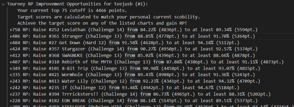
Releasing stuff like this into the wild is also great for getting feedback that makes you go “oh why didn’t I include that from the start?!” Mid-event, I also extended the algorithm to assess the ranking points that raising a score to the scobility target would buy back, and provided a list of #grindset recommendations to go along with the lists of best/worst scores.
im sujeet!(:

other questions that came up

  • Why isn’t this built into the ITL website?
    • In 2023 it would’ve been too much of a drain on the small dev team standing up the website to add a whole new lil system on the pile. Also it was implemented in full Python. But
hold that thought.
  • Can I get more recommendations?
    • Since I was disseminating all these stats publicly for everyone, I implemented an artificial limit to prevent the competitive folks from doing a little bit too much research into their opponents (ITL dovetails right into the summer tourney season). Towards the end of ITL2023 I relented and cut it loose. Ideally I’d just make it so each person only got to see their own scobility results.
  • Can scobility and its recommendations be tuned to a player’s skillset for individual techniques?
    • Maybe, but I’m not going to do that! Unless I get super bored.
  • But most importantly
how the heck do I interpret the scobility parameters?
    • If you were a completely “convex” player – not necessarily the highest possible skill level, but perfectly well-rounded, with zero skillset gaps – after having your personal ideal run on every chart, all your score quality ratings would be exactly the same. In reality, different players are good at different things. You might outperform other folks in simple stamina-based charts, or lack the experience (or the pad reliability!) to perform particular techniques. This makes the score qualities scobility measures spread out a bit from a perfect flat line.
    • Assuming that a spice rating of dead zero means the chart is so simple that the player can dig the absolute depths of their timing ability for each individual note, I labeled the Y-intercept as “timing power”. Over in IIDX land, the player’s raw reading/passing ability is humorously known as “earth power”, so maybe there’s subconscious influence in the naming

    • The individual parameter that seems to skew the distribution most strongly is a player’s bias toward easy-to-time charts, so the slope of the line turns out to be the most meaningful secondary observation. For scobility’s lifespan up until v2023.x, I referred to it as the “comfort zone”. Players that focus on perfecting low-spice charts get a negative number here, and players that like to challenge spicier content receive a positive number. But “negative” isn’t a bad thing, it’s just the way the math represents it.
    • To recap: “timing power” is your fundamental ability to score well, and “comfort zone” is your preference for charts that are simple vs. complex to score on.

One small problem with that two-parameter system, though
why is scobility giving so many folks the L?
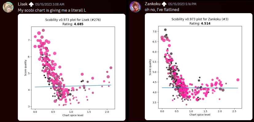
looks like that plain ol’ linear best fit is missing something.
clearly we can do much better


the 2024 update: “2 > 1”

how?

Ever the doubles aficionado, a solution came to me instantly: instead of a singular best-fit line
we must have two! But good luck finding a library that does that sort of thing directly. Fortunately enough, the approach is not much more complex than a linear least squares problem, but it does have some additional steps. (If you don’t want to see the math, you can skip down to the next heading 😅)

We can split the left half of the graph (the ascender of the L) and the right half of the graph (the arm of the L) into two separate linear equations, M(s) = m(s – u) + b and H(s) = h(s – u) + b, where (u, b) represents the vertex of the L and is the same for both. From a human viewpoint, it seems like it should be clear where that division of left and right happens – we should be able to pinpoint (u, b) easily, right? Programmatically it’s not that simple. There are plenty of clustering methods, but those aren’t guaranteed to give us a truly optimal solution.

To start, note that the optimal location of (u, b) could theoretically lie between any adjacent pair of charts on the spice ladder – or even directly on one. If we want the best possible fit, we can divide up the spice axis into intervals, record the best fit for when u lies within each interval, and then pick the best of those bests.

  1. Let’s first sort the spice ratings, si, and represent each interval with a cut index c. In other words, we’re interested in values of u that lie within [sc , sc+1].
  2. Our cost function will be the least squares residual of our new fit over the whole dataset. We want to minimize that to get the ideal fit.
  3. For each adjacent pair of sorted spice ratings (sc , sc+1), we’ll carry out this set of calculations:
    1. Assign all points left of u to be evaluated against M(s), and all points right of u against H(s).
    2. Perform a naive least-squares fit on each of those sets of points. This covers any optimal solution that might lie between pairs of spices. With an unconstrained intersection (u, b), it’s possible for u to land outside the interval [sc , sc+1] – in which case, it contradicts our sampling division, and we throw this option away.
    3. Then, consider our boundary conditions. When u is anchored to either end of the interval (set to either sc or sc+1), it loses its independence, and we can now combine the two equations into a single three-variable matrix equation:
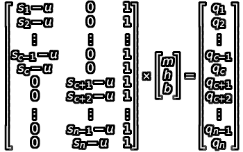
    4. We can apply a least-squares approach to this as well. By evaluating (ATA)-1(ATB), we get the following formula for evaluating our “best L-fit”:
    5. Evaluate this formula under each endpoint (u set to sc , u set to sc+1 ). We now have as many as three options for a potential best-fit here!
    6. Select the best option among these two or three potentials based on the combined least squares residual over both halves.

Then, the solution to the overall analysis is whichever cut point and its associated fit parameters gave us the lowest residual!

what?

Alright, cool, but do those parameters have any intrinsic meaning, or are they just numbers that make the overall math work?

  • Given the spicy theme of both ITL2024 and scobility itself, I dubbed the slope of the two halves of the L-fit “mild sauce” and “hot sauce”. As you progress to spicier charts (i.e., add sauce), how does your timing ability tolerate it? And as before, negative values represent strength on milder charts, positive on spicier.
  • We can still assess the “timing power” by tracing the mild portion of the L-fit back to the dead zero spice level.
  • I deliberated for weeks (months?) over what the intersection point must represent, and thus, what to call it. Up until the final days of implementation I was referring to it as the “unga bunga elbow” because it seemed to indicate the player’s ability to time under pressure, and anything past that was simply them surviving the chart and not necessarily focusing on timing better – that is, going unga bunga mode. But not everybody’s unga bunga elbow is their L-fit minimum! Some folks experience a tapering-off there, and others actually have a maximum at that intersection (perhaps their innate timing focus needs a little extra training?). Eventually I settled on calling it the “spice horizon”, and adding little descriptors to explain how to interpret it in all those different situations.

where? when?

It took me a good long while to figure out how to approach solving the co-constrained best-fit, and then to have the free time to implement it. Apologies for leaving everybody who entered ITL2024 to fend for their own for the first two months 😅 (and much appreciated to the folks that ran scobility on their own for bridging the gap!) 

But your patience can now be rewarded! Here’s a bunch of new features:

  • Recommendations now consider both song points (SP) and EX points (EP) when calculating the recoverable ranking point value.
  • Singles and doubles are split out into their own modes.
  • You can have as many recommendations as scobility can offer!

Also it’s a website now, so you don’t have to navigate a cloud drive to find your own recs. Please be nice to it I’m not much of a web designer (yet) 🙏
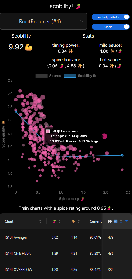
dark theme I lose track of my mind…

P.S. For those curious, this is the stack:

  • Data scrape and spice rating analysis in Python
  • …uploaded to a MySQL database on Azure SQL Server
  • …served by FastAPI on an Azure Function
  • …fronted by a Next.js (React/TypeScript) app with Ant Design components, layout and style by TailwindCSS, hosted as an Azure Static Web App
Categories
rhythm games

scobility đŸŒ

What if block rating…didn’t matter?

I’ve been getting into D&D a lot lately so the urge to write “Tasha” here was overwhelming

problem statement

Over the last few years in the post-ITG score attack scene, it’s become somewhat painfully apparent that a single number doesn’t do a good job of summarizing the difficulty of a chart.

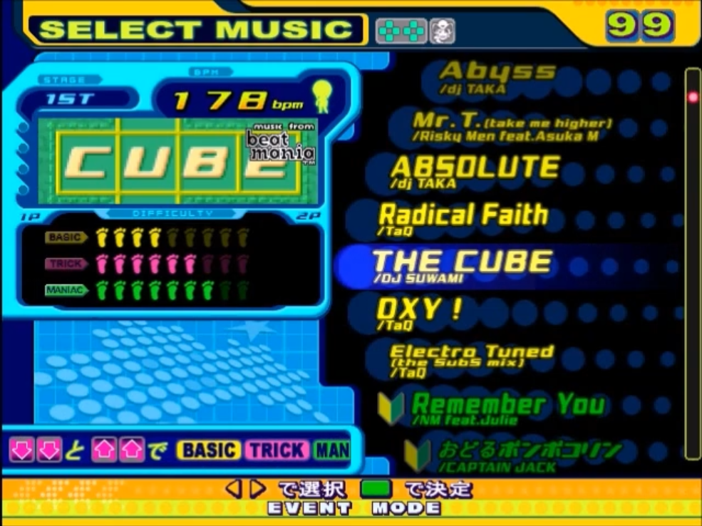
The single number attached to a chart is its “block rating”, or the number of blocks that the DDR song wheel fills in when you scroll over it. This also used to be known as “foot rating” back when DDR used a string of little feet instead of blocks.

hehe, look at the little feet. you need SEVEN feet to play THIS game! (Dance Dance Revolution 5th Mix Song List, YouTube)

It’s generally agreed that this block rating is a measure of how hard it is for a player to survive the chart until the end – that is, the “passing difficulty.” A chart rated 9 could be extraordinarily complex or straightforward to a fault, but if your goal is simply to survive the chart, you can expect it to be comparable to other 9s (or “9-footers”).

Simfile artists and tournament organizers have tried various methods to give the player a little more warning about the complexity of a chart, relative to its plain block rating:

  • Finer divisions of the block rating (e.g., a 12.9 will be much more difficult when compared to a 12.1)
  • A secondary descriptive scale (e.g., a 12-D will be much more complex than a 12-A)
  • A bunch of secondary descriptive scales that work together (DDR called it the “groove radar”; the score attack folks have a “tech radar”)
  • Listing what’s actually in the chart (also known as “tech notations”)
  • Capitulation
the keyword here is “descriptive”. (“Suffering radar” prototype, TaroNuke)
just let the community figure it out. (skittles prime pack banner, Chief Skittles)

However, every rhythm game community loves to argue about difficulty ratings (it’s our FGC character matchups or maybe fantasy sports leagues). Why should tacking on an extra number or two change that? Now we have more numbers to discuss!

I think there’s value to having as consistent a rating scale as possible, but I also don’t like how all new simfile releases have come down to “bro this number is wrong…how could you assign the wrong number bro.” And I feel like part of the reason these discussions happen so much is the subjective origin of all the number choices. If a human picked it, the human could be wrong – or, at the very least, it is fertile ground for an opinion.

sorae wrote a chart recently. (International Timing Collective discord server)

International Timing League and its very large dataset had me thinking, though. If enough people play the same set of charts, some sort of ordering should emerge – and maybe we can derive a scale that’s totally empirical, without per-chart human involvement? Since only passes were recorded for event purposes, I assumed that it wouldn’t say much about the passing difficulty, but the player’s-best score data is quite rich.

first forays

The concept of “scobility” started to materialize:

  • Compare pairs of charts by listing which entrants played both and comparing their scores between the charts. Some sort of shape should materialize in the scatterplot, and the “harder” chart is the one the entrants are getting lower scores on.
  • Fit an equation to this shape that will serve as a predictor: suppose a new entrant pops up with a score on chart A; by using this function, we should be able to approximate what their score on chart B should be.
  • Assemble these pairwise relationships into some relatively monotonic ordering, and if there’s a compounding numeric parameter that falls out of the ordering, use that as the complexity rating or “spice level” of the chart.

I tossed the final ITL dataset into a jupyter notebook and started messing around, plotting chart scores against other charts’ scores and looking for patterns.

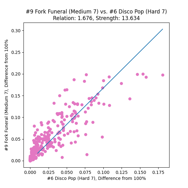
most pairs of charts fanned out from the (100%, 100%) point, but held well to…a linear relationship? often with a small curve at the very upper end, if either song was particularly 100%-able.
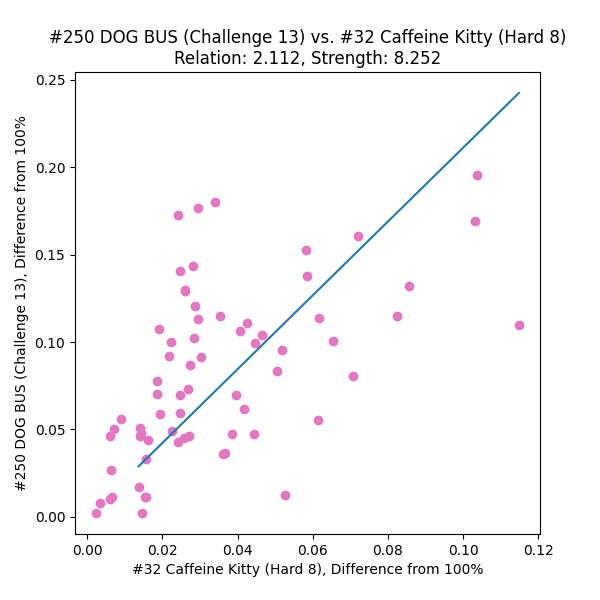
for comparison, a pair of songs that were a little less 100%-friendly and had fewer common players. “relation” is the coefficient of the best-fit line through the origin, and “strength” is the reciprocal of the RMS of the best-fit errors.

Armed with a few dozen chart relationship plots, I came to the conclusion that

  • a plain ol’ linear best-fit through the (100%, 100%) point
  • with scores under 80% (“struggling to pass” territory) discarded
  • with scores over 99% (“you should move on” territory) discarded

might be enough to establish numeric relationships between charts.

spice level

For any* pair of charts in the ITL dataset, we now have a way to derive scores on one chart in terms of the other – and what’s more, it’s a single multiplicative coefficient per pair. How do we string together a reasonably monotonic ordering based on all these relationships?

I think the “right” approach here would be to construct a graph and minimize travel distances by removing direct links where a shorter hop-through exists. I started to code this up and then became Lazyℱ:

  1. Derive the coefficient for each pair of charts in both directions.
  2. Sort all (~105, shush) of these relationships.
  3. Throw out every ordered chart pair under 1×.
  4. Starting from the closest pair to 1× and working upward, insert the involved charts (B vs. A) into a running list:
    • A walks along the line ascending until it finds the first already-placed chart, C, that loses to it (i.e., C vs. A has a coefficient less than 1×).
    • B does the opposite of all that (walks the line descending, looking for the first winning chart).
    • If either chart is already in the line, skip it.
  5. Repeat until all* charts are in the running list.

In practice, when the neighbors in this list are each compared, this gets us almost all the way to fully monotonic – but it could be slightly better, there were 10~20 obviously misfiled charts at this stage. So I took a few iterations and bubble sorted any out-of-order pairs that could be improved by simply swapping their positions 😳

The ordering could still be better, though. Comparing neighboring charts makes for a reasonable first pass. If our view extends a few spots to either side, does the placement of each chart still seem sensible? At this point I began incorporating the strength of each relationship (based on the number of entrants in common).

  1. Assign a provisional “spice value” of 1 to the first chart in the list.
  2. Walk down the list in ascending order.
  3. Multiply each chart’s provisional value by the coefficient with its next-door neighbor to get the next chart’s provisional value.

Once all charts have a provisional value, walk the list again:

  1. Check the relationship each chart has with its neighbors a few spots up and down the list.
  2. Multiply the neighbors’ spice values by the coefficient they share with the focus chart. (If the spice values are accurate, these products should all be the same!)
  3. Take the weighted average, using the strength of each relationship as the weight. (Self-weight is determined by the number of people that played it.)
  4. This average value will be retained as the result.
chart D compared to its three neighbors on each side. in these one-on-one contests, chart B is found to be spicier and the player overlap is strong, whereas charts C and F are more or less indistinguishable from D and contribute less to the average. the overall result is that chart D was “overrated”, and its spice value will decrease slightly.

Charts can be re-organized by their new spice values, and this “windowed” neighborhood approach can be iterated as appropriate. A few swaps do happen in the first few iterations, but I was surprised to find that the ordering and values converge pretty strongly to a final arrangement after a few hundred iterations! (using a –10/+6 lopsided window, still fiddling with these values too…)

Now, the question of presentation…how do I express a “spice level”? Since it took a compounded multiplication to achieve each chart’s value, I don’t want to lose precision (or sow discouragement) in the low end, so I figured a logarithm of the raw spice content would be suitable.

and then you have the “log arrhythmic” scale – what on earth is happening with those upper end multipliers? – but I guess you really just need to know whether your mouth will be on fire or not. (CoCo ICHIBANYA)

By using log2 of the raw spice value, I can set up a nice relationship: if a chart’s spice level increases by one, it is “twice as hard” to score on – for example, a 98% score on a 2.0蟛 chart would be as powerful as a 96% score on a 3.0蟛, or a 92% score on a 4.0蟛.

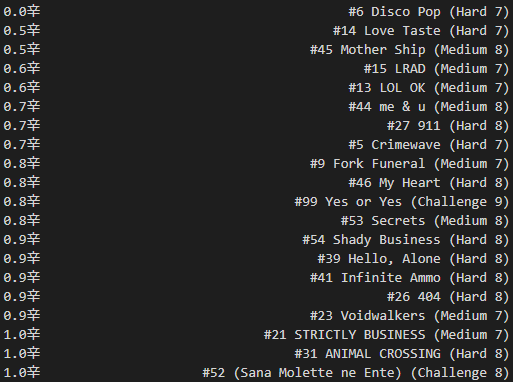
And, without further data massaging, we have a “spice ranking” of all* the ITL charts!

“I always knew Disco Pop was to ITG ratings as water’s freezing point was to Celsius” ~anonymous consultant
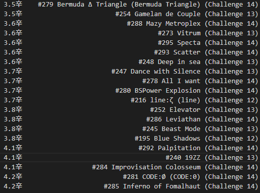
wow! these charts are all very angry!

* Some charts just weren’t played by enough people (hello, Technological Transcendence full mix).

what’s in it for the player?

Applying the concept of spice level even further: it should be possible to look at a player’s scores and pick out the ones that are particularly good, or could be easily improved.

I was heavily influenced, even just to start this project, by ereter’s dp laboratory, which ranks IIDX double players and charts by their clearing strength, using (maybe) magic or (probably) something similar to what I’m inching towards here. A player summary and a skill analysis was always on the menu.

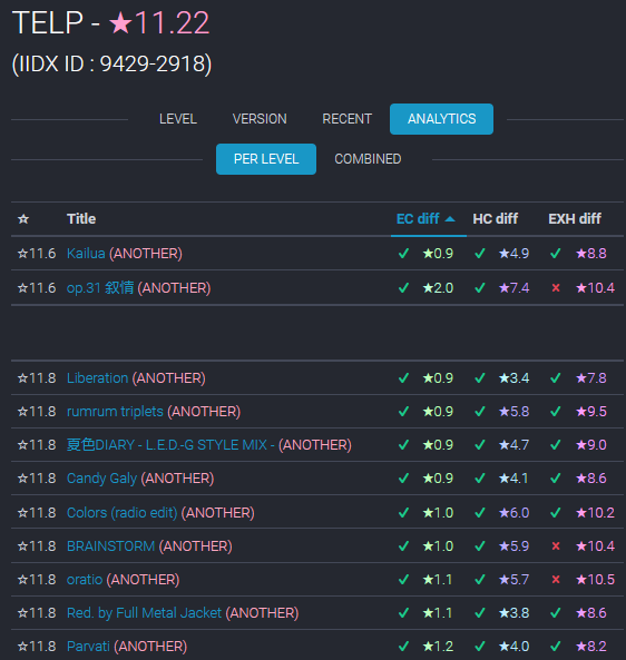
accidental brag here…still need to EXHC op.31 tho #nojojo (ereter.net)

First, I needed a measure of each score’s quality. Because every increment of spice level represents a doubling of “lost dance points”, I needed to convert that quantity to a logarithmic representation as well.

  • I subtracted each score from 100% (plus a tiny bit extra for asymptote avoidance) and took log2. The better the score, the smaller this number.
  • Then I anchored the value by running a score of 0% through the same formula and subtracting it.
  • Finally, this quantity gets subtracted from the spice level to determine the score quality.
math is easier to read, tbh.

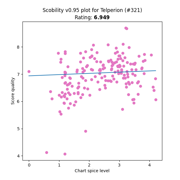
The expectation behind this quality calculation is that a perfectly consistent player should be able to get the same score quality on every chart. Due to skillset differences and the number of runbacks, this isn’t going to be exactly true, but it should hold pretty well. And the results were very encouraging:

pretty representative. this guy couldn’t even quad [7] Disco Pop by the end of the event, but he’s feeling vindicated now…check out that point near (0, 7)!

Not only that, but it’s very little extra work to:

  • Rank players based on this average scoring ability, or “scobility”
  • Observe whether the player is stronger at “harder” or “easier” songs, by checking a trend line
  • Ranking the quality of each player’s scores, and picking out:
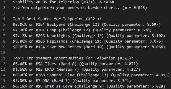
    • The best 5, as standout scores
    • The worst 5, as improvement opportunities
[7] DNA being on that list of improvement opportunities feels like a callout. Backyard felt good tho

If you were a reasonably active participant in ITL, you can have a look at what scobility thinks about you here. Curious whether you agree 🙂 Also, the source code is on github.

confirmed Good At Gameℱ (REAL) (MATHEMATICALLY PROVEN)
I also started prototyping a “tournament ranking” system but I don’t think it’s ready for primetime yet. maybe someone else can take up the reins…?

oh, and one more thing…

None of these calculations incorporate block rating!

Well, in some sense it does, because folks opted to play some songs and not others, looking for whatever particular challenge suited them. But I’m hoping that evened itself out pretty well.

Now if only we had something like this for passing difficulty… đŸ„ž

appendix

I know you’re gonna ask about puns, but really, “scobility” = “score ability” because I love portmanteaus too. It’s also a nod to jubeat’s “jubility”, as well as the Scoville heat rating scale that inspired a lot of the aesthetic.

warpdrive really do be putting the spicy arrows tho (twitch.tv/bromid)

A few additional thoughts and/or disclosures:

  • One major shortcoming of this method is that you need a sufficient number of players playing every song to run these calculations. There’s no way to assign a value to a chart just from looking at chart features, at least for now.
  • Aggregate stats are hard. Simply averaging all score qualities for a player benefits people who only play songs they’re good at. It might be a better idea to calculate based on a player’s top 50 or something. Sounds familiar…
  • I feel more comfortable using data from an event that put a lot of participants in a tourney mindset – I have more faith that folks put effort (and maybe multiple plays) into their scores, instead of half-hearted one-offs on charts they didn’t like, which would skew certain songs poorly.
    • The long term of the event might have some side effects of improvement, though – if an entrant made too many gains then maybe their score correlations will warp the results!
  • Expressing spice level any more precisely than the tenths place probably isn’t worth it, due to all the fudge and kludge packed into the estimation process.
  • There are a bunch of tunable parameters in this process that I’ve eyeballed or ballparked at most:
    • Score quality offset
    • Spice neighborhood window
    • Iterations of bubble sort and window sort
    • Number of required common players to establish a chart pair
    • Best-fit strategy (linear vs. ???, discarded data point cutoffs)
  • How well will this process apply outside the Waterfall scoring scheme? Does the reduced granularity of old-school ITG (i.e., GrooveStats) pose problems?
    • Could we shoehorn the skillattack or 3icecream data into it?? I suspect the DDR “money score” system would just defeat any high quality SDGs…
  • Spice level need not stay constant – in fact, it should be allowed to update as more scores accumulate, and shouldn’t be baked into chart files.
    • Tech-ni-cal-ly players could take an adversarial approach and grind down (or sandbag up) the spice level of some chart…
    • There’s also no real need to pre-calculate the spice level when considering a chart for event or tournament inclusion. Just run regular spice level updates, and once enough players have tried the chart, it will fold itself into the rankings 😎

shoutouts

  • The ITL committees, especially VincentITG and teejusb for their insanely hard work getting the event up and running with this level of automation, enabling this kind of analysis.
  • G_Wen for the daily data scrapes, saving me from doing an API deluge of my own.
  • Various fellow players that helped me steer my trains of thought as I teased progress.
  • Dancing with one’s hands in one’s pockets.