“parametric trouble? just fit it double”
did Team Rocket learn this one in Meowth class?
initial reception
Well, scobility turned out to be a big hit with the post-ITG timing community! I mean, it literally did numbers. I ran it about once a week during International Timing League 2023 and posted the results to cloud storage – nothing fancy – but I was surprised by how many folks were willing to give it a shot, and also how often the recommendations turned out to be accurate. No, really! I thought they would be much less dependable.
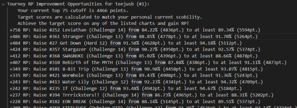
Releasing stuff like this into the wild is also great for getting feedback that makes you go “oh why didn’t I include that from the start?!” Mid-event, I also extended the algorithm to assess the ranking points that raising a score to the scobility target would buy back, and provided a list of #grindset recommendations to go along with the lists of best/worst scores.
other questions that came up
- Why isn’t this built into the ITL website?
- In 2023 it would’ve been too much of a drain on the small dev team standing up the website to add a whole new lil system on the pile. Also it was implemented in full Python. But…hold that thought.
- Can I get more recommendations?
- Since I was disseminating all these stats publicly for everyone, I implemented an artificial limit to prevent the competitive folks from doing a little bit too much research into their opponents (ITL dovetails right into the summer tourney season). Towards the end of ITL2023 I relented and cut it loose. Ideally I’d just make it so each person only got to see their own scobility results.
- Can scobility and its recommendations be tuned to a player’s skillset for individual techniques?
- Maybe, but I’m not going to do that! Unless I get super bored.
- But most importantly…how the heck do I interpret the scobility parameters?
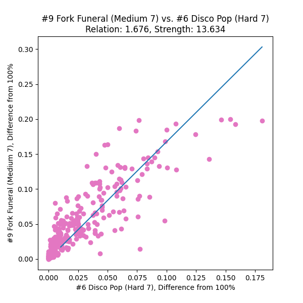
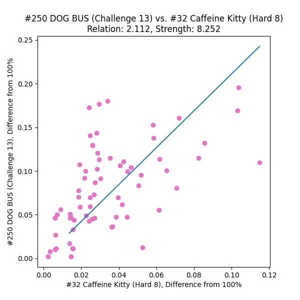
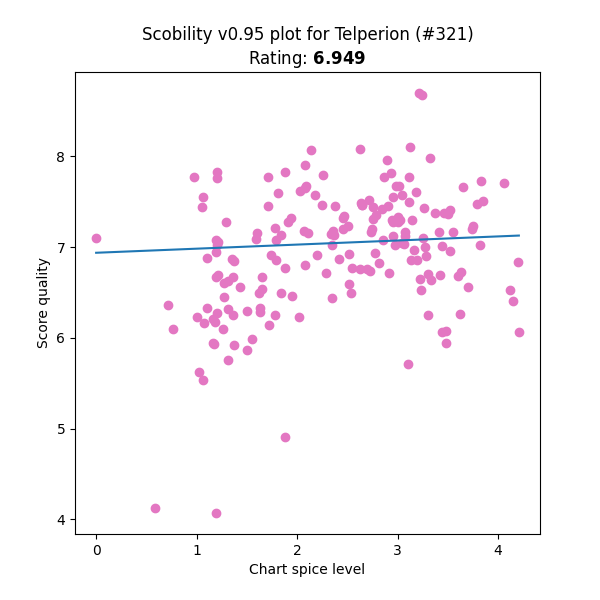
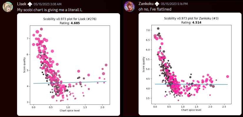
- If you were a completely “convex” player – not necessarily the highest possible skill level, but perfectly well-rounded, with zero skillset gaps – after having your personal ideal run on every chart, all your score quality ratings would be exactly the same. In reality, different players are good at different things. You might outperform other folks in simple stamina-based charts, or lack the experience (or the pad reliability!) to perform particular techniques. This makes the score qualities scobility measures spread out a bit from a perfect flat line.
- Assuming that a spice rating of dead zero means the chart is so simple that the player can dig the absolute depths of their timing ability for each individual note, I labeled the Y-intercept as “timing power”. Over in IIDX land, the player’s raw reading/passing ability is humorously known as “earth power”, so maybe there’s subconscious influence in the naming…
- The individual parameter that seems to skew the distribution most strongly is a player’s bias toward easy-to-time charts, so the slope of the line turns out to be the most meaningful secondary observation. For scobility’s lifespan up until v2023.x, I referred to it as the “comfort zone”. Players that focus on perfecting low-spice charts get a negative number here, and players that like to challenge spicier content receive a positive number. But “negative” isn’t a bad thing, it’s just the way the math represents it.
- To recap: “timing power” is your fundamental ability to score well, and “comfort zone” is your preference for charts that are simple vs. complex to score on.
One small problem with that two-parameter system, though…why is scobility giving so many folks the L?
clearly we can do much better…
the 2024 update: “2 > 1”
how?
Ever the doubles aficionado, a solution came to me instantly: instead of a singular best-fit line…we must have two! But good luck finding a library that does that sort of thing directly. Fortunately enough, the approach is not much more complex than a linear least squares problem, but it does have some additional steps. (If you don’t want to see the math, you can skip down to the next heading 😅)
We can split the left half of the graph (the ascender of the L) and the right half of the graph (the arm of the L) into two separate linear equations, M(s) = m(s – u) + b and H(s) = h(s – u) + b, where (u, b) represents the vertex of the L and is the same for both. From a human viewpoint, it seems like it should be clear where that division of left and right happens – we should be able to pinpoint (u, b) easily, right? Programmatically it’s not that simple. There are plenty of clustering methods, but those aren’t guaranteed to give us a truly optimal solution.
To start, note that the optimal location of (u, b) could theoretically lie between any adjacent pair of charts on the spice ladder – or even directly on one. If we want the best possible fit, we can divide up the spice axis into intervals, record the best fit for when u lies within each interval, and then pick the best of those bests.
- Let’s first sort the spice ratings, si, and represent each interval with a cut index c. In other words, we’re interested in values of u that lie within [sc , sc+1].
- Our cost function will be the least squares residual of our new fit over the whole dataset. We want to minimize that to get the ideal fit.
- For each adjacent pair of sorted spice ratings (sc , sc+1), we’ll carry out this set of calculations:
- Assign all points left of u to be evaluated against M(s), and all points right of u against H(s).
- Perform a naive least-squares fit on each of those sets of points. This covers any optimal solution that might lie between pairs of spices. With an unconstrained intersection (u, b), it’s possible for u to land outside the interval [sc , sc+1] – in which case, it contradicts our sampling division, and we throw this option away.
- Then, consider our boundary conditions. When u is anchored to either end of the interval (set to either sc or sc+1), it loses its independence, and we can now combine the two equations into a single three-variable matrix equation:
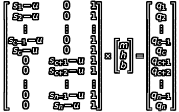
- We can apply a least-squares approach to this as well. By evaluating (ATA)-1(ATB), we get the following formula for evaluating our “best L-fit”:

- Evaluate this formula under each endpoint (u set to sc , u set to sc+1 ). We now have as many as three options for a potential best-fit here!
- Select the best option among these two or three potentials based on the combined least squares residual over both halves.
Then, the solution to the overall analysis is whichever cut point and its associated fit parameters gave us the lowest residual!
what?
Alright, cool, but do those parameters have any intrinsic meaning, or are they just numbers that make the overall math work?
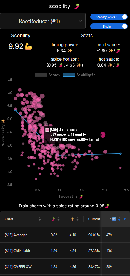
- Given the spicy theme of both ITL2024 and scobility itself, I dubbed the slope of the two halves of the L-fit “mild sauce” and “hot sauce”. As you progress to spicier charts (i.e., add sauce), how does your timing ability tolerate it? And as before, negative values represent strength on milder charts, positive on spicier.
- We can still assess the “timing power” by tracing the mild portion of the L-fit back to the dead zero spice level.
- I deliberated for weeks (months?) over what the intersection point must represent, and thus, what to call it. Up until the final days of implementation I was referring to it as the “unga bunga elbow” because it seemed to indicate the player’s ability to time under pressure, and anything past that was simply them surviving the chart and not necessarily focusing on timing better – that is, going unga bunga mode. But not everybody’s unga bunga elbow is their L-fit minimum! Some folks experience a tapering-off there, and others actually have a maximum at that intersection (perhaps their innate timing focus needs a little extra training?). Eventually I settled on calling it the “spice horizon”, and adding little descriptors to explain how to interpret it in all those different situations.
where? when?
It took me a good long while to figure out how to approach solving the co-constrained best-fit, and then to have the free time to implement it. Apologies for leaving everybody who entered ITL2024 to fend for their own for the first two months 😅 (and much appreciated to the folks that ran scobility on their own for bridging the gap!)
But your patience can now be rewarded! Here’s a bunch of new features:
- Recommendations now consider both song points (SP) and EX points (EP) when calculating the recoverable ranking point value.
- Singles and doubles are split out into their own modes.
- You can have as many recommendations as scobility can offer!
Also it’s a website now, so you don’t have to navigate a cloud drive to find your own recs. Please be nice to it I’m not much of a web designer (yet) 🙏
P.S. For those curious, this is the stack:
- Data scrape and spice rating analysis in Python
- …uploaded to a MySQL database on Azure SQL Server
- …served by FastAPI on an Azure Function
- …fronted by a Next.js (React/TypeScript) app with Ant Design components, layout and style by TailwindCSS, hosted as an Azure Static Web App